You can find examples of all our reports at OilAnalysisLab.com
An Example gear report layout is as per below.
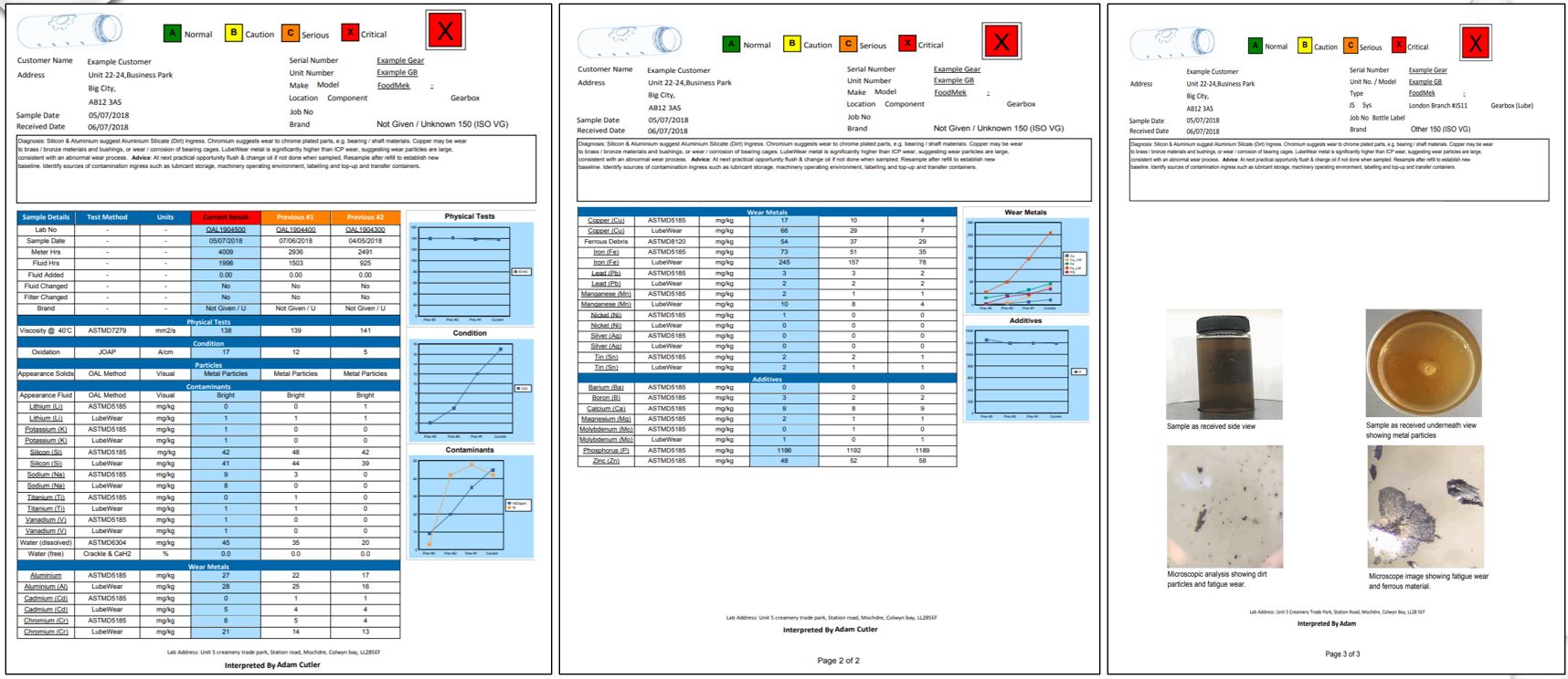
The basic layout of a report is the machinery information is listed at the top. The tests, methods and units are on the left. The current sample is the pale blue column and the historical data is to the right. Note on specification type reports such as Adblue ISO specs or fuel EN590 spec you may have a limit style with Min and Max values for a test instead of history, but the layout is otherwise the same.
On the right hand side you will have some graphs if relevant to your sample type to show trend data and on the last page you will have some pictures (usually 2 for side and underside appearance of bottle view), but depending on what the labs deems relevant they may upload other relevant pictures to the report too. You can see these pictures all in high definition on the sample results view. Just click the lab number of your sample at the top of the column and you will be taken to that page (you may have to login first).
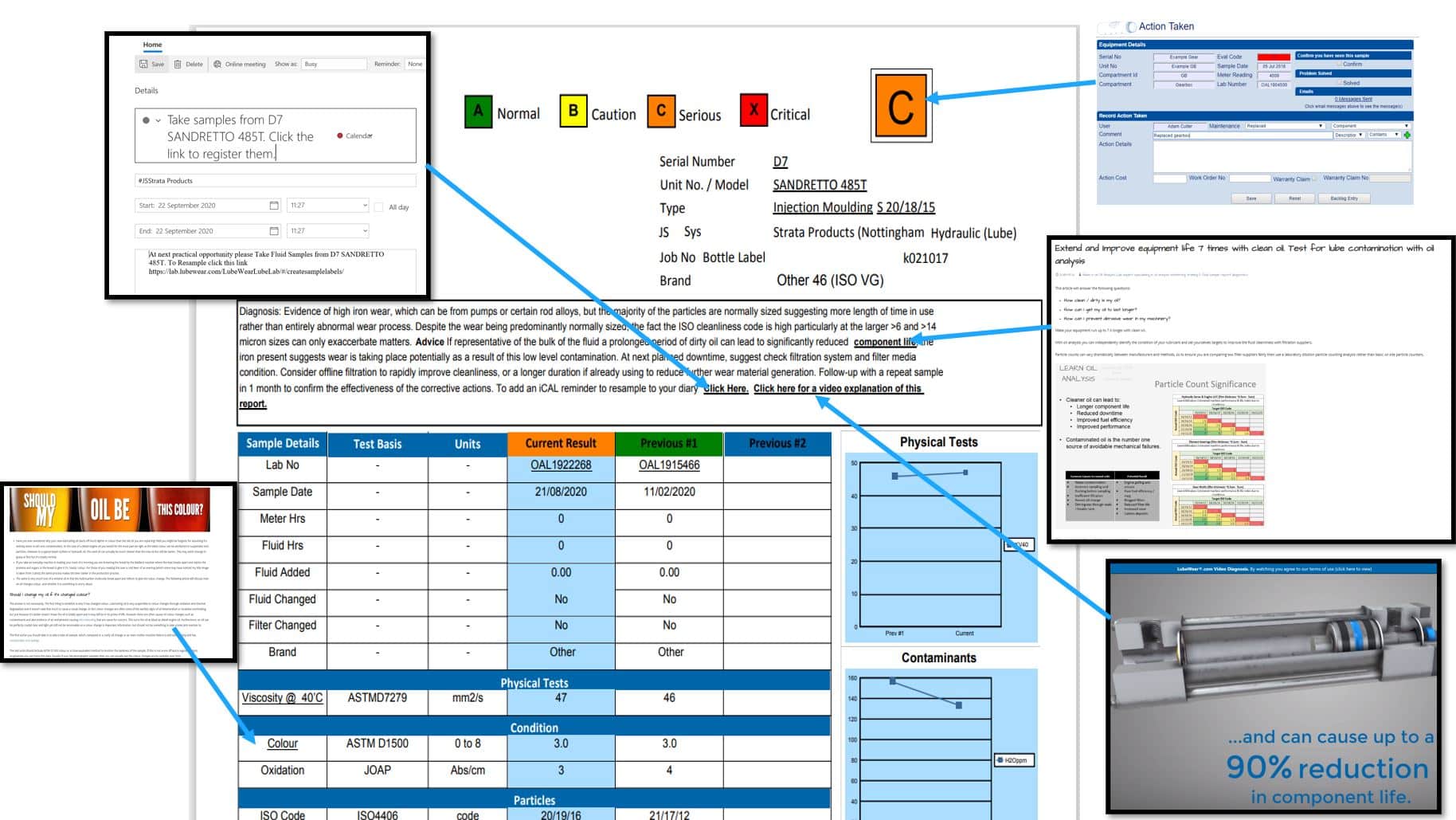
What’s different to other reports? Why are there two of each element on the report?
The layout may not be too dissimilar to layouts you have seen from other laboratories, but we have a few subtle differences. The first is with wear metals we provide them two different ways. The first is by the ASTMD5185 method which is what every other lab uses, and the second is by our proprietary LubeWear® method. This detects wear that ordinarily would be missed by ordinary oil analysis so by comparing the two methods you can determine not just how much wear is present but how abnormal or significant it is. You can find out more about LubeWear here.
The other thing that is unique is our interactivity with the reports. Gone are the days where a lab robotic interpretation is sent to you and you get no real contact with the lab, instead, with LubeWear.com you get tonnes of interactive features to help you, train you and explain the testing results in clear non-jargon speak. Not every feature will be on every report as they may not all be relevant, but below are just a few examples (starting from the top left clockwise I will explain them).
- Being asked to take a re-sample or follow-up is quite a common place to confirm a problem or establish a trend, but you are busy and may forget to do so. Hence you can click the re-sample reminder in the diagnosis and it will open up a calendar invite in your PC calendar e.g. outlook or your iPhone calendar app. This will remind you when to take that re-sample and take you straight to the pre-registration page.
- Following a report you sometimes have to do something. Maybe change the oil, or maybe something more serious. Clicking on the letter flag on the top right corner allows you to let us know what you have done since the last sample e.g. replaced a component, which means when the diagnostician comes to analyse your next sample they can see exactly what maintenance you have performed and advice accordingly. We have also added a really simple “problem solved” tick box, so we know what we recommended solved your problem and will know to recommend the same if you have a similar experience in future.
- Removing wordiness of a report. Sometimes certain words may be jargon to those not familiar with reading oil analysis reports. Words like leaching microdieseling etc may not be things you are aware off. We could write a long description explaining the term, but those who know what it means will get annoyed at having to read all that long text. Instead, we highlight words you may not know and take you straight to an explanation of them. In this case we have said it causes reduced component life because of the dirty oil and this takes you through to a calculator to see how much life could be reduced (or improved if you clean the oil).
- LubeWear video Diagnosis is a world first and on certain common diagnosis scenarios we have 1 minute summary videos to explain exactly what is going on in your machinery.
- Don’t know what a test means e.g. a colour with a value of 3 may not make sense, but click on the underlined test name and it takes you straight through to an explanation of the test.